
📑Table of Contents:
- Why SMS traffic needs a different kind of landing page
- Match the landing page to the message.
- Design for mobile first, not mobile later
- Prioritize page speed from the start.
- Keep the headline and CTA instantly clear
- Remove distractions and reduce friction
- Use trust signals, but keep them tight
- Make personalization and continuity feel natural
- Avoid dark patterns and manipulative design
- Do not forget SMS compliance on the page itself
- Test the page like a conversion asset, not a design asset
- Final thoughts

SMS can generate fast attention. However, attention alone does not create results. If your landing page fails to match the speed, clarity, and intent of the text message, even a strong SMS campaign can lose momentum.
That is why landing page design matters so much for SMS marketing. Text messages arrive in a channel people check constantly, and they often drive immediate action. Yet the click is only the beginning. Once someone taps your link, the landing page must carry the conversation forward. It needs to load quickly, look clean on mobile, explain the offer right away, and make the next step feel obvious.
This matters even more because SMS traffic is inherently mobile. People usually tap links from their phones, not from desktops. Google’s landing page guidance for advertisers emphasizes that improving mobile landing page speed can improve results, and Google notes that a one-second delay on mobile can reduce mobile conversions by up to 20 percent in some retail contexts.
So, if you want SMS campaigns to perform better, start with the destination. A high-converting SMS landing page does not try to do everything. Instead, it focuses on one audience, one offer, and one clear action.
Why SMS traffic needs a different kind of landing page
SMS traffic behaves differently from other traffic sources. Someone who clicks a text message usually acts in the moment. They may be standing in line, commuting, scrolling between tasks, or responding to a limited-time offer. Because of that, their attention window is short.
As a result, SMS landing pages need to do three things extremely well: load quickly, communicate value quickly, and reduce friction quickly.
That is not just a design preference. It reflects how mobile users behave. Recent reporting on Unbounce’s 2025 landing page findings indicates that mobile now drives the majority of landing page visits, yet desktop pages still convert by a notable margin. In other words, marketers get mobile traffic but often fail to create mobile experiences that convert it.
SMS amplifies that challenge. When someone clicks from a text, they expect a direct path to the promised outcome. If the page looks cluttered, loads slowly, or forces too many decisions, visitors often leave before converting.
Therefore, SMS landing pages should feel more focused than standard website pages. They should also feel more immediate than pages built for broader ad traffic.
Match the landing page to the message.
The first rule of SMS landing page design is simple: the page should feel like a continuation of the text message.
If your SMS says, “Get 15% off your first order today,” the landing page should clearly and immediately repeat that offer. If your text promotes a flash sale, the page should show that sale right away. If your message invites people to book an appointment, the page should open with the booking flow rather than a generic homepage experience.
This message aligns with the matter by reducing confusion. It also reassures the visitor that they landed in the right place. Google’s landing page evaluation guidance stresses the importance of relevance between the ad click and the landing page experience. Although that guidance comes from paid search, the same principle applies to SMS traffic: the closer the page matches the promise of the click, the easier it becomes for visitors to take action.
So, avoid sending SMS traffic to a general homepage unless it already functions like a focused landing page. In most cases, a dedicated page will convert better because it removes distractions and keeps the message consistent.
Design for mobile first, not mobile later
Because SMS clicks almost always come from mobile devices, mobile-first design should shape every decision on the page.
That means more than a responsive layout. It means designing the page for thumbs, small screens, limited patience, and quick decisions.
A strong mobile-first SMS landing page usually includes:
- a short headline above the fold,
- a clear CTA button early on,
- large tap targets,
- short sections with generous spacing,
- minimal navigation,
- forms with as few fields as possible.
These elements help by reducing effort. They also make the page easier to scan. Industry guidance on SMS landing pages from providers such as Infobip and Omnisend similarly emphasizes mobile-first layouts, short paths to action, and pages designed specifically for text-driven visits.
Additionally, mobile-first design should account for distractions. SMS visitors often have less patience than those reading a long email or researching on a desktop. Therefore, every extra scroll, every cluttered section, and every unnecessary choice can hurt conversions.
Prioritize page speed from the start.
Fast pages convert better because they respect momentum.
When a person taps a link from a text message, they expect the next page to appear almost immediately. If it does not, the emotional energy from the click starts to disappear. Then, even a great offer can lose its impact.
Google’s PageSpeed Insights documentation explains that the tool uses both lab and field data to evaluate page experience, and Google Ads guidance directly links mobile landing page speed to better performance. Google also highlights that even a one-second delay can significantly affect mobile conversion rates.
Because of that, teams should treat speed as a conversion feature rather than just a technical task.
To improve speed, simplify what loads first. Compress images. Reduce bulky scripts. Limit third-party tools. Use lightweight design patterns. Most importantly, test the real mobile experience rather than just checking the page on a desktop browser.
A beautiful page that loads slowly is still a weak page for SMS traffic.
Keep the headline and CTA instantly clear
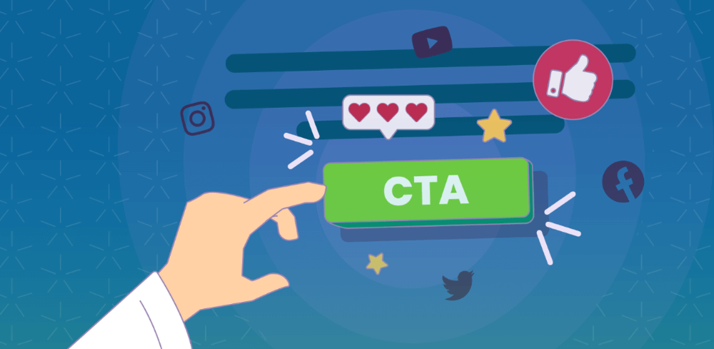
SMS traffic converts best when the visitor understands the offer within seconds.
That is why headline clarity matters so much. Your headline should answer the visitor’s first question immediately: “What am I getting here?” Right below it, the CTA should answer the next question: “What should I do now?”
For example, if the SMS promotes a discount, the page headline should restate the offer in plain language. If the text invites someone to schedule a demo, the page should make scheduling the dominant action. If the SMS pushes shoppers back to a saved cart, the page should move them directly toward checkout.
This sounds obvious, yet many landing pages still bury the main action below carousels, long intros, or broad brand language. Meanwhile, Baymard’s 2025 checkout UX benchmark reports that most leading ecommerce sites still perform “mediocre” or worse in checkout UX, highlighting how often brands lose conversions to avoidable friction.
Therefore, do not make the visitor work to understand the page. Let the offer lead. Then let the CTA follow naturally.
Remove distractions and reduce friction
SMS traffic usually has strong intent, but that intent can fade quickly. So, the landing page should make action easier, not harder.
That means stripping away anything that does not support the conversion goal. Full navigation menus, unrelated links, competing CTAs, oversized footers, and long blocks of copy can all pull attention away from the next step.
At the same time, forms should stay short. If the page asks for too much information too early, drop-off will rise. This is especially true on mobile, where typing feels slower and more annoying.
For e-commerce pages, checkout friction matters as much. Baymard’s current benchmark shows that most sites still leave major UX issues unresolved in checkout, and those gaps lead directly to lost sales.
So, if your SMS campaign sends visitors to a purchase page, reduce the number of form fields, enable autofill, clearly surface payment options, and remove any steps that do not help close the sale.
Use trust signals, but keep them tight
A focused landing page should still build confidence. However, trust signals need to support the conversion, not overwhelm it.
Good trust elements include:
- a short customer review,
- star ratings,
- clear shipping or return information,
- security reassurance at checkout,
- concise proof points such as “10,000+ customers served.”
These details help because SMS clicks often happen quickly. The visitor may not know your brand well, or they may need just a little reassurance before acting.
However, keep these signals tight and relevant. One or two strong proof elements often work better than a wall of logos or a crowded testimonial section. The goal is to remove doubt without slowing the page down.
Make personalization and continuity feel natural
SMS is a personal channel. Therefore, the landing page should preserve that feeling.
If possible, carry the message’s context into the page. For example, a returning shopper can land on a saved cart, a subscriber can see the specific discount mentioned in the text, or an appointment reminder can open directly to a booking confirmation flow.
This continuity reduces effort and makes the experience feel intentional. Omnisend and Infobip both stress that SMS landing pages work best when they connect message context to a mobile-friendly next step, rather than sending traffic into a generic browsing experience.
In other words, the less the visitor has to reconstruct from memory, the better the page will convert.
Avoid dark patterns and manipulative design
Conversion-focused design should still respect the user.
That means no misleading countdowns, no hidden terms, no confusing opt-ins, and no forced choices that pressure someone into sharing more data than they intended. In July 2024, the FTC announced results from a review of websites and apps, showing that many used dark patterns that could manipulate consumers into making purchases or giving up their privacy.
That finding matters here because SMS traffic often arrives with urgency. When marketers combine urgency with manipulative design, they may increase short-term clicks but damage trust and long-term performance.
Strong landing pages convert through clarity, relevance, and ease. They do not need tricks.
Do not forget SMS compliance on the page itself
The landing page also plays a role in SMS compliance, especially when it collects phone numbers for future campaigns.
If the page includes an SMS sign-up form, the opt-in language should clearly state what the user is agreeing to receive. It should also explain how to opt out. CTIA’s messaging principles and best practices emphasize consumer consent, opt-in and opt-out standards, and privacy expectations across the messaging ecosystem. Meanwhile, the FCC’s revocation rules made it easier for consumers to revoke consent to unwanted robotext messages, with key provisions taking effect on April 11, 2025.
So, if your landing page captures numbers, make transparency part of the design. Clear consent language does not just help compliance. It also builds trust.
Test the page like a conversion asset, not a design asset
Even a strong first version should not stay static. Landing pages convert better when teams test them.
Start with the biggest levers:
- headline wording,
- CTA copy,
- button placement,
- form length,
- hero image or no hero image,
- discount framing,
- trust signal placement.
Unbounce’s benchmark work and related 2025 reporting continue to reinforce the importance of ongoing landing page optimization, especially for mobile performance gaps.
However, test with discipline. Change one meaningful element at a time. Measure conversion rate, bounce rate, scroll depth, and downstream results such as completed purchases or booked demos. Then, keep what clearly improves performance.

Final thoughts
Designing landing pages for SMS traffic is really about protecting momentum.
The text message creates attention. The landing page has to convert that attention before it disappears. Therefore, the best SMS landing pages stay tightly aligned with the message, load fast on mobile, remove friction, and make the next action unmistakably clear.
That approach matters because mobile visitors already outnumber desktop visitors on many landing pages, yet mobile conversion often still lags. Brands that close that gap can get much more value from the SMS clicks they already earn.
If you keep the page focused, fast, and easy to act on, SMS traffic becomes much more than a burst of clicks. It becomes a reliable source of conversions.